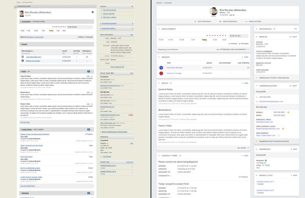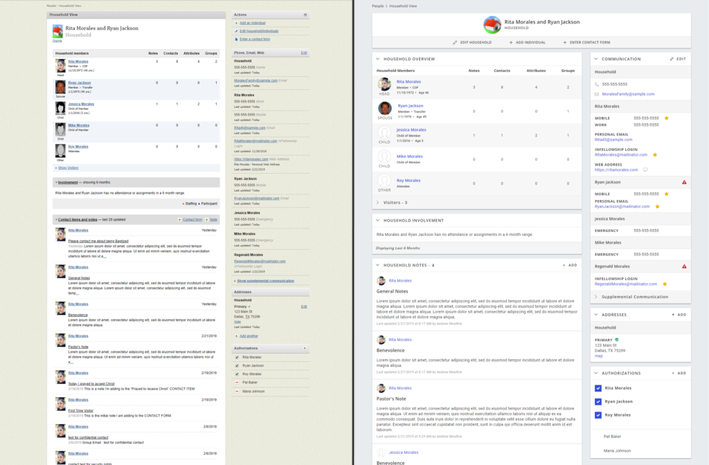
We’ve been making major headway on the Individual and Household pages, and hope you find them both easy to use and pleasing to the eyes (especially after our last release!). Here is an overview of functionality that wasn’t available on the legacy pages, which you may find useful on the new pages:
New functionality on the Individual page:
- View someone’s status, substatus, DOB and age directly at the top of the page
- Add requirements directly from the Individual page from the Requirements Card’s “Quick Add” menu, just like you’ve been able to for all other cards on the Individual page.
- Using the “Save Page View” feature (available in the “More Actions” menu just below an individual’s name) you can expand or minimize all sections on the page. This includes the following, which weren’t available on the legacy page:
- Specific Attribute Groups
- Specific Requirement Types
- Additional Profile Information
- Span of Care details
- Supplemental Communication
- Visitors (in the Household card)
- View someone’s first record date within the main Profile card (it’s no longer hidden with the additional details)
New functionality on the Household page
- See a separation between Notes and Contact Items like you’re used to on the Individual page
- See details on who added each Note and Contact item
- See Contact Item information on status, who it’s assigned to, and when it was created and updated
- Add Contact Items and Notes directly from the Household page using their “Quick Add” menus, like you’ve been able to on the Individual page
- See icons that indicate:
- Preferred communication methods
- Email unsubscribes
We hope you’ve also found benefit from faster page load times (we’re seeing the new pages load an average of 5-6 seconds faster than their older counterparts), and some tweaks to the People Search page that improve search time and enable you to choose how many people return in your results (no more limit of 20 people before needing to advance to the next tab).


